Hi ya peeps!! Sorry I haven't been around for the last week. I thought I had the flu. I did get a flu shot so I thought maybe it was a new strain? I felt constantly nauseous. After a trip to the doc it turned out to be an inner ear infection caused by allergies! Has anyone else had that happen? It's sure a first for me *sighs*
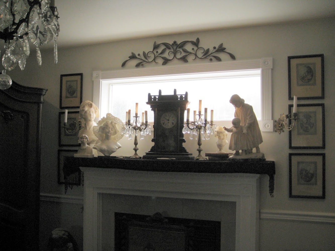
BUT on to my other difficulties... I've been "trying" to refresh the mantel in my family room. It's never quite looked right to me (it's fine just doesn't quite capture "wow" kwim?) and truthfully after about 2 hrs of moving things around it still doesn't. Sooooo I'd really love your opinions. I have lots of things to work with just can't quite get it right. I think mantels are one of the most difficult things to accessorize. Kind of like perfectly crimped and cooked pie crust... Looks so simple but to get it just right can be tricky Anyhoo I've got three examples to show you and I'd love to hear what you think? Please tell me what you'd do (or do differently?)
Here is how it currently sits. Somehow if I add more to it, it ends up looking junky and too busy.

Here's another option using more stuff.

And here's the busiest variation IMO.

OK so based on a combination of the comments I've received thus far, I've come up with this. I've tried to balance the elements and keep some bling too *winks* Do you like this one any better?

And a full fireplace shot.

What I FINALLY ended up with (for now at least because I'm tired! Those busts are HEAVY!!) Is this variation based on all the great opinions you gave me. Thank you so much for sharing your ideas. They really did help me figure this out. Love you guys!

Full shot

So busy or minimalist? To bling or not to bling? Which if any appeal to you? I'd sure love to hear what you think.*winks* Does anyone else struggle with their mantelscapes? Vanna
I'm joining up with my dear friend Marty at a Stroll Thru Life for:
